Oregon Medical Association
The Oregon Medical Association (OMA) website aimed to transition from the original Drupal CMS to the RiSE content management system, ensuring seamless integration with OMA’s robust member database. By prioritizing user experience, the redesign focuses on intuitive navigation that allows physicians, physician assistants, and medical students to easily access essential resources and services. The project sought to transform the previous cluttered design into a sleek and modern interface, enhancing clarity and accessibility while effectively highlighting OMA’s advocacy, policy initiatives, and community-building efforts. This revitalized online presence serves to better connect members and facilitate engagement within Oregon’s medical community.

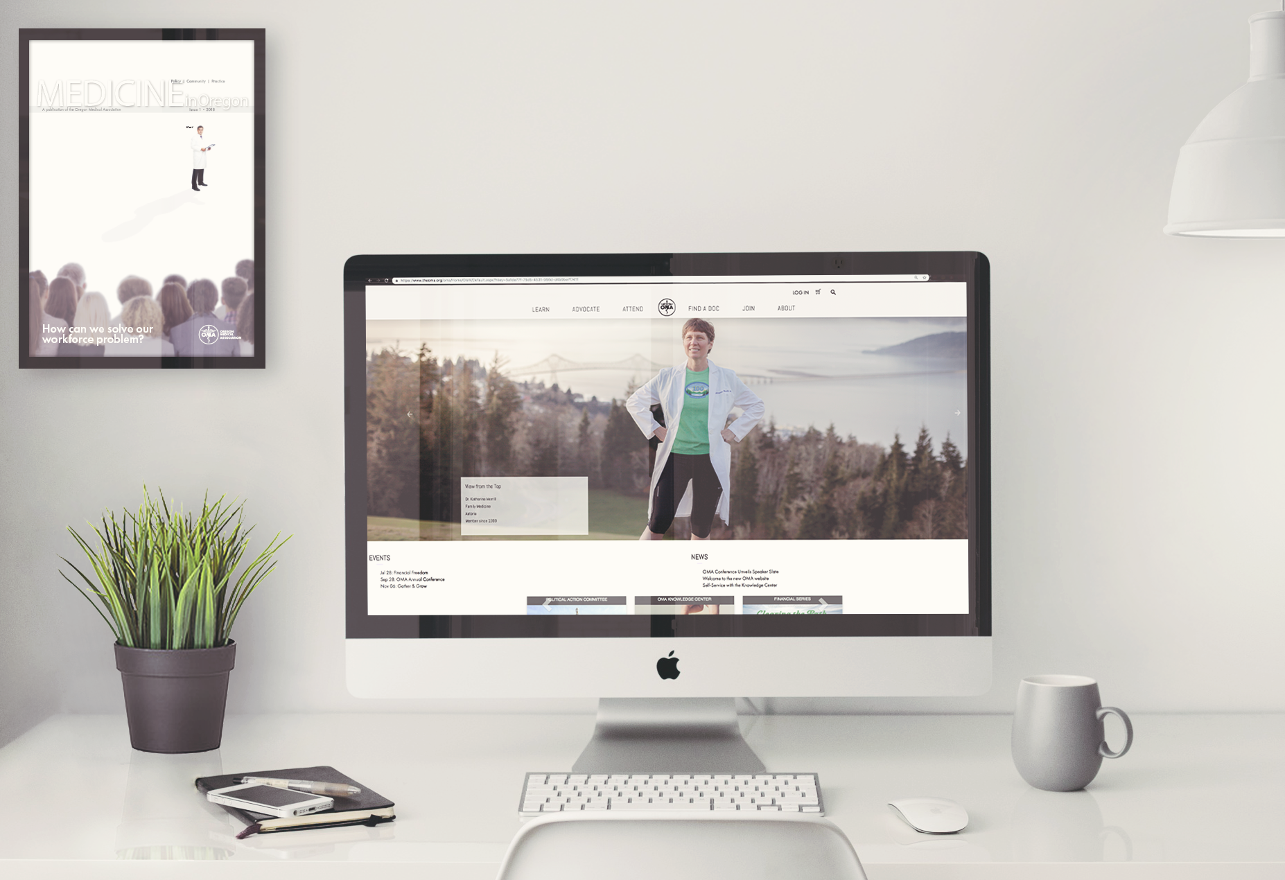
Photography of Physicians: Features Oregon doctors and providers engaging in recreational activities such as biking, running, and surfing, highlighting their personal interests beyond medicine.
Clean and Compartmentalized Pages: Organized individual pages for the organization that enhance clarity and usability, improving the overall user experience.
Rebranding and revitalization: Transitioning from the outdated Times New Roman font to the sleek Futura PT, which offers a versatile library including “Book” for body text and “Thin” for notes.
PROVIDENCE
Providence Health Plan Expansion into Orange County, Ca
As part of a strategic three-year acquisition effort, I played a pivotal role in developing the web presence for Providence Health Plan’s expansion into Orange County, California. I was responsible for crafting the web content for a new page, leveraging Figma to design an intuitive user experience that effectively translated technical content. My collaboration with stakeholders, IT teams, and product managers ensured streamlined communication and project management, utilizing tools like Workfront. Additionally, I focused on optimizing SEO and enhancing user navigation while aligning with organizational goals and WCAG compliance. Committed to delivering innovative, budget-friendly solutions, I also produced training materials to empower teams on content management best practices.


Intake Forms: Created input forms to capture user geographic locations and healthcare needs, syncing this data seamlessly with backend systems to link to tailored plans based on regional demographics, improving overall service delivery.
Page Structure: Produced clean and compartmentalized pages, enhancing clarity and usability for a better overall user experience.
WCAG Compliance: Ensured all content meets accessibility standards, making the site navigable for individuals with disabilities.
Streamlined Communication: Managed efficient workflows using project management tools to facilitate collaboration among stakeholders, IT teams, and product managers.
Limerent
The Limerent website build is a dynamic project dedicated to reshaping perceptions and approaches surrounding alcohol and other drugs among parents and youth. Designed as a central hub, the website highlights Limerent’s diverse range of clients and initiatives focused on substance use awareness and education. Through engaging content and user-friendly navigation, it not only showcases impactful projects but also features the dedicated staff whose expertise drives these initiatives. By fostering informed discussions and providing valuable resources, the website aims to empower families and communities to navigate the complexities of substance use more effectively, ultimately contributing to a broader cultural shift in how these issues are understood and addressed.
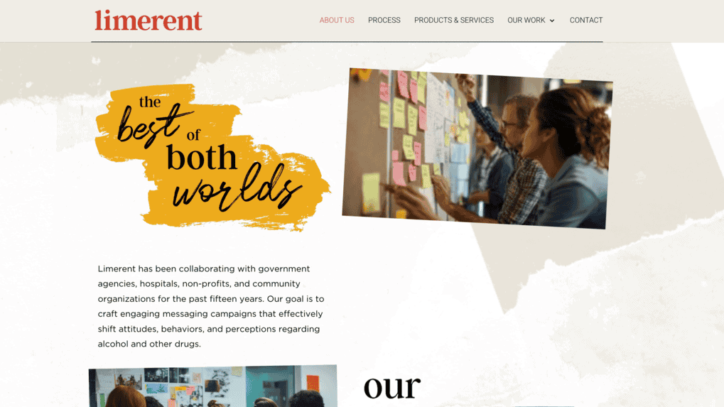
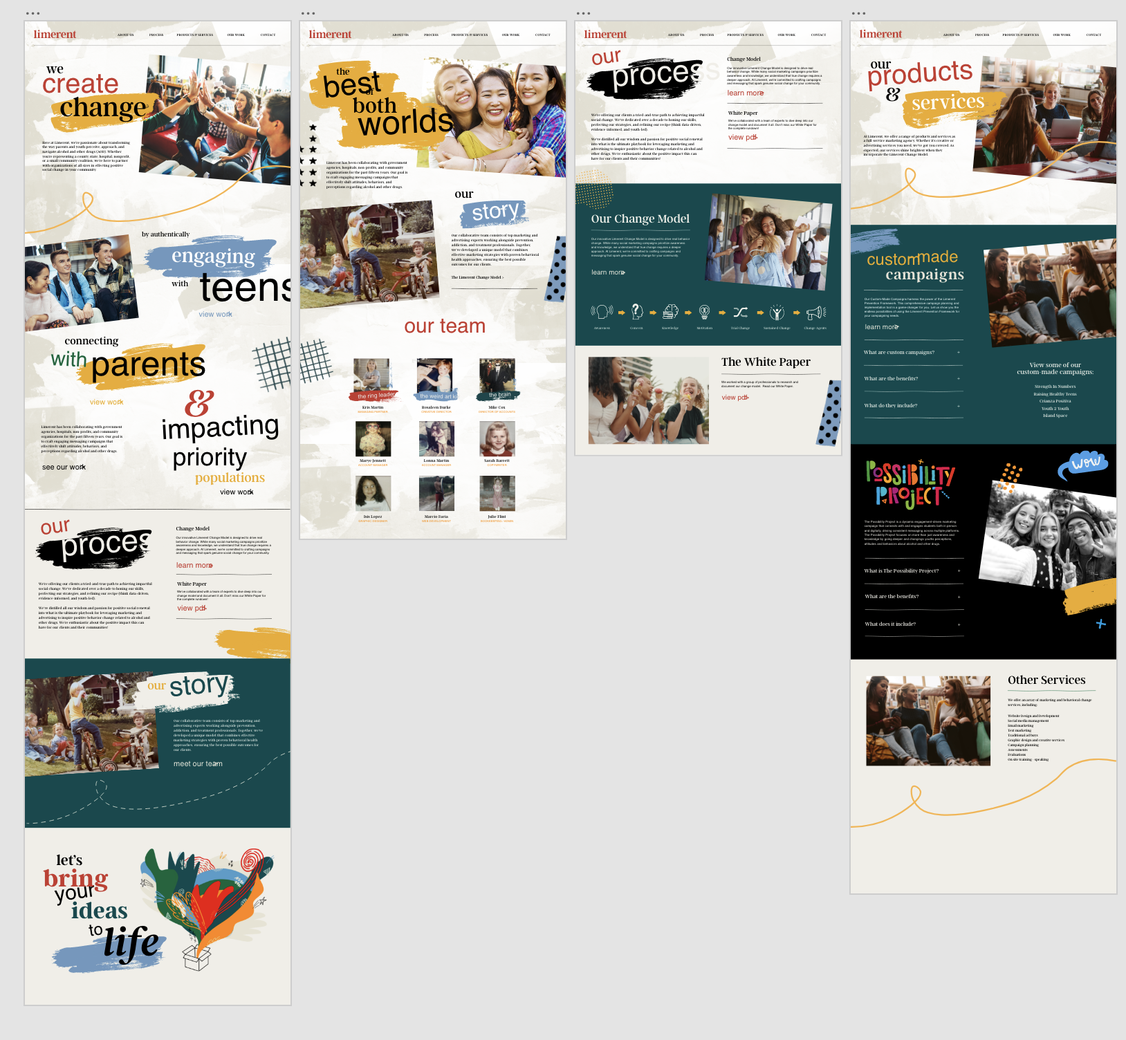
Image Focus: Highlighting onsite events targeted at youth.
Engaging Messaging: Campaigns designed to positively change attitudes and behaviors related to alcohol and drug use.
Social Marketing: Emphasizing awareness and education while recognizing that meaningful change demands a more profound strategy.
Collaborative Team: A synergy of leading marketing and advertising professionals collaborating with experts in prevention, addiction, and treatment.
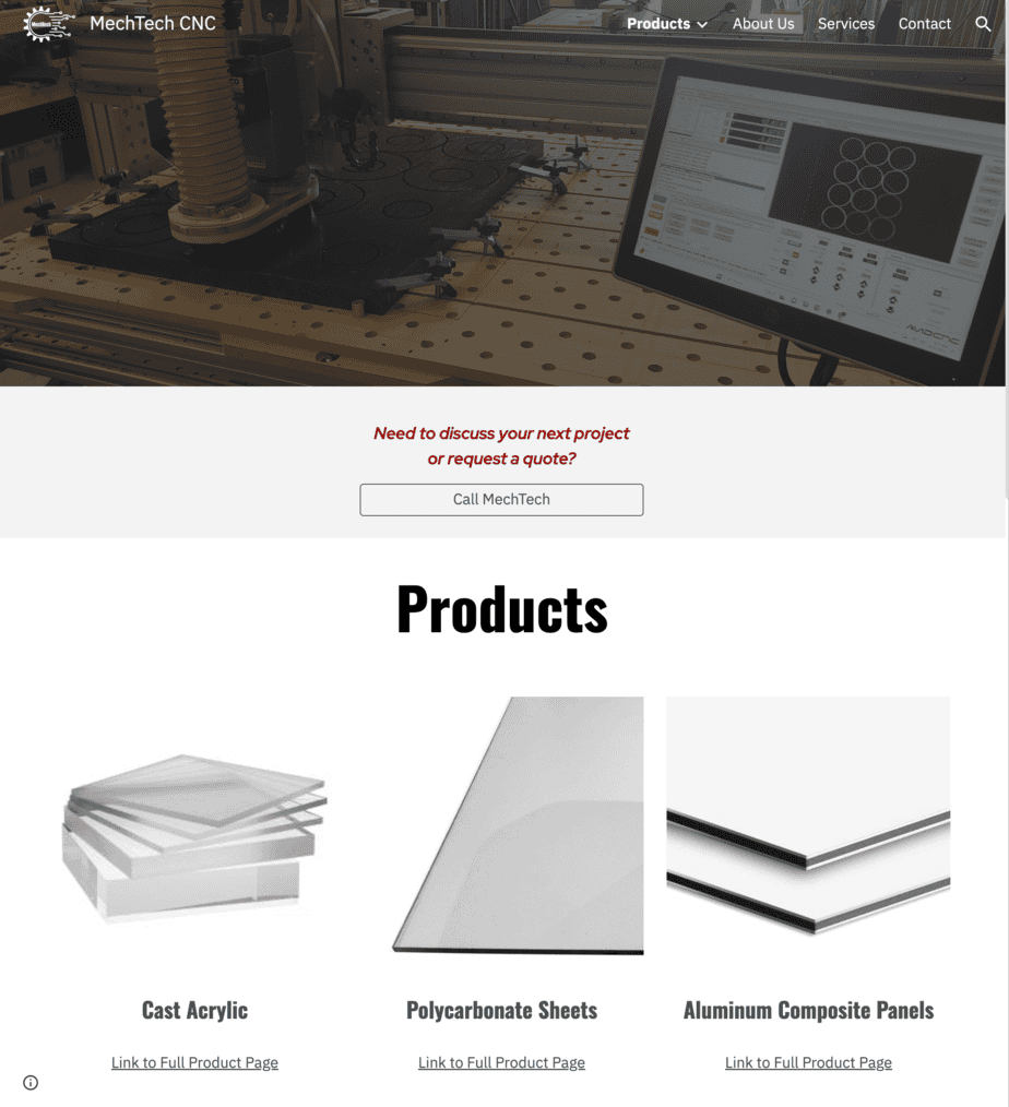
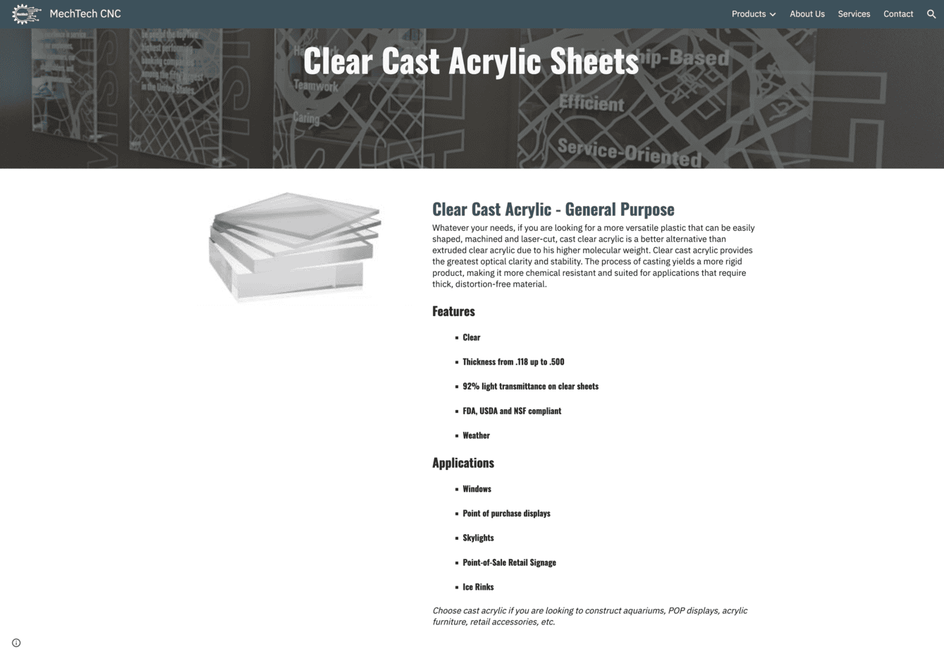
MechTech
This project involved the comprehensive redesign of a website dedicated to providing precision-engineered solutions tailored to meet diverse business needs. By emphasizing the materials available for sale alongside showcasing the custom products crafted by the shop, the redesigned site aims to enhance user experience and facilitate easier access to key offerings. The new design employs a modern aesthetic and intuitive navigation, allowing customers to quickly explore both the extensive range of materials and the innovative solutions available for their complex industrial projects, commercial enhancements, or bespoke client products. This strategic focus ensures that the site not only highlights the company’s expertise in CNC router technology but also effectively supports clients in realizing their unique visions.
Branding Overhaul: Transforming a small private shop into a robust production powerhouse.
Engaging Messaging: Highlighting key phrases like “Tailored Service, Unparalleled Quality.”
Stronger Imaging: Emphasizing product examples with high-quality, detailed visuals.
Information and Formatting: Refreshing color schemes, fonts, and information hierarchy for clarity and impact.
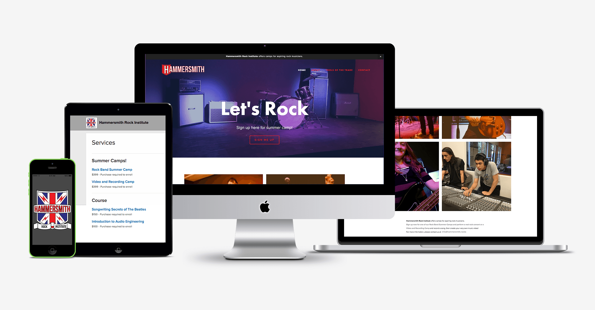
Hammersmith
Introducing a revolutionary music institute, brainchild of the Portland School of Rock founders, designed to make music education accessible to everyone. Our comprehensive services for this project included brand and concept design, project management, wire framing, user interface design, and development on Squarespace CMS using HTML, CSS, and carefully curated font selection and color palette. Additionally, we provided layout design, motion graphics, graphic design, photography, and user training and education to bring this vision to life.